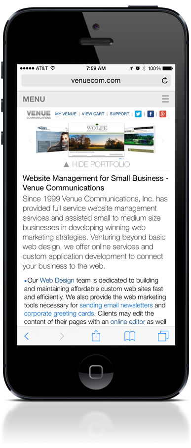
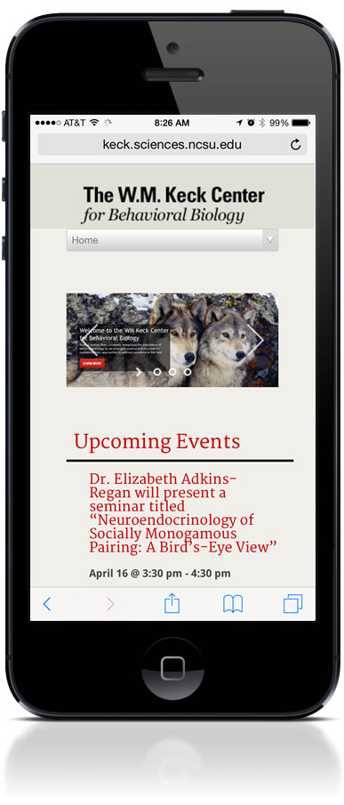
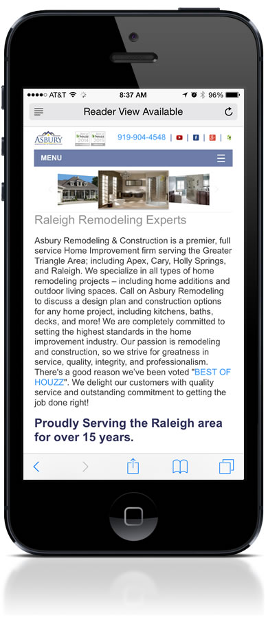
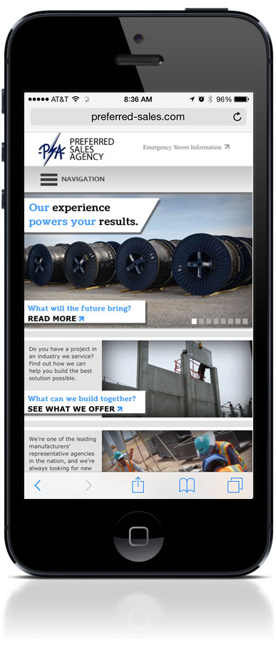
These are examples of responsive web design from our portfolio, shown as they appear on a phone. Each one is a single website that reshapes itself for the screen it is opened on, rather than a separate mobile site running alongside a desktop one. The same pages, the same content and the same web address serve a phone, a tablet and a desktop.
They are drawn from different industries on purpose. A restaurant, a professional practice and a retailer have very different priorities on a small screen, and a good mobile design reflects what that particular business needs a visitor to do first.
![]() |
![]() |
![]() |
![]() |
What to look for in a mobile design
It is worth knowing what you are judging, because most people can tell a mobile site is poor without being able to say why. The things that matter are consistent across every example above.
Readable without zooming. Text should be large enough to read at arm's length, at the size it loads, with no pinching. No sideways scrolling. Content should fit the width of the screen, and wide tables should become readable lists rather than running off the edge. Navigation built for a thumb. A desktop menu bar does not survive on a phone, so it becomes a menu with targets big enough to tap accurately, positioned where a thumb naturally reaches. Images that scale. Photography should fill the space available without forcing the page sideways or taking an age to load on a mobile connection. Forms that can actually be completed. A contact form is where a phone visit turns into an enquiry, and it is the single most common thing to be got wrong.
One design, every screen size
Responsive design is not two layouts, a small one and a large one. The page adjusts continuously as the screen gets wider, which is why these designs also work on tablets, on a laptop with a browser window dragged to half the screen, and on whatever screen sizes arrive next. Designing for one specific device is how the previous generation of mobile sites became obsolete, and it is worth avoiding twice.
Common mobile mistakes
The recurring problems we are asked to fix are nearly always the same handful. Menus and price lists published as PDF downloads, which are slow, awkward to read on a phone and poorly understood by search engines. Phone numbers set as images, so they cannot be tapped to call. Interstitials and pop-ups that cover the content on a small screen before a visitor has read anything. Contact details reachable only through several taps, when they are the reason most people opened the site at all.
Every site we build is responsive
Responsive design is not a separate product or an add-on here. It is how we build every site, as standard and at no additional cost, and it has been that way for years. If your existing site predates that, a website redesign can reuse the content you already have rather than starting from nothing.
The quickest assessment is one you can do yourself in a minute: open your site on your phone and try to do what a customer would do. Find the phone number, read a paragraph, tap a menu item, submit the contact form. If any of that is a struggle, contact us using the support button at the top of any page and we will look at it with you.
Learn more about our mobile-friendly responsive design service